A story in three acts:
I. Problems
II. Solutions
III. Lessons Learned
I. First, we have some issues to address
The style guide Has Problems, and it breaks three rules of documentation:
-
if what I need isn’t in the docs, they’re incomplete;
-
if nobody wants to use the docs, they’re broken;
-
if you can’t fix what’s wrong, they’re useless!
These were huge underlying issues for the SmartSync style guide, ostensibly the controlling document that describes exactly how the platform works and behaves. Other places call them design systems.
We called it a decade-old Word document.

The style guide only resembled as-built SmartSync at the most surface level. Documentation had long ago been left behind. New problems had arisen that didn’t have solutions in the guide. When things got built, the docs were a pain to update — et voilà, now we have a design system that provides no systemization for design. What a steaming pile of merde.
Docs exist to make things easier for people, but this one made things a lot harder. Most components described themselves in one-off, inline styles. Changing the style for a button in the master style sheet wouldn’t update them everywhere. Just changing a button position required tracking down all of its iterations and manually updating its styling. God forbid you wanted to do something complex, like change its color — which is exactly what we needed to do.
 What do you mean, “we defined lines 54 different times?” Surely, they’re all unique, right?
Medtronic is an amoeba, constantly absorbing smaller companies and using them to make itself bigger and stronger. These new corporate organelles all have their own special colors and styles that needed to be displayed in SmartSync. Unfortunately, there was no way to make that happen. We didn’t even have a way to describe how to make that happen.

What a mess. What did we need?
#1: BE EASY TO UPDATE
Please, no more Word documents. No more getting sign-offs from three system administrators just to correct a typo. No more relying on pages and pages of tables and the horrible built-in search function. Oops, did someone delete an entire section by accident? Shame — there’s no version history.
The new style guide was going to be a living document. As problems needed solving, changes could be made. They’d get written down instead of existing just in the heads of a bunch of engineers.1 Bugfixes will get documented!
It was going to be the brave new world of 2014.

We only had eight weeks, and three of them were gobbled up by Thanksgiving and Christmas. We didn’t have time to go out shopping for a shiny design documentation platform — any time spent not writing was time a-wasting. So we settled on the steadfastly corporate Confluence. Not ideal, but it got the job done. Everyone could access it, anybody could update it, and it was on our intranet.
Perfect is the enemy of good.
#2: UNIFY ALL DESIGNS
Without anyone coming in and keeping designers and engineers in line, SmartSync had metastasized into a quivering mass of components that looked different and did the same thing. Impossible to add new things, and heaven help our poor users trying to deal with that visual mess. Some buttons were here, others were there — nobody who built it had looked at the style guide. Sad part is that even if they had, so much was missing from it that it probably wouldn’t have helped.
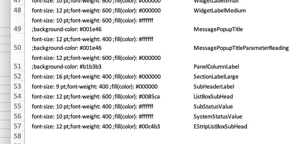 There were 57 styles defined just for typography.
So we fixed it. We edited and purged and cut until we got rid of everything that made the system harder to use and challenging to understand. There were conflicts with stakeholders about this. People don’t like change, especially if it makes more work for them. But we do the hard work now so we don’t have to do even more later.
#3: BE LINKED TO SOFTWARE RELEASES
A special quirk of working in a regulated industry is that the Food and Drug Administration has to sign off on everything we build. That means one version of the style guide might be government-approved for one product but not for another. We need to track which versions were okay for which products.
We already meticulously track all sorts of design decisions2 in the rest of our work. We weren’t doing it here because there was no tool in place to do it. So we fixed that too.
All this was supposed to take a year. We were given just eight weeks. I wound up leading a team of three fresh-faced junior designers, and we did it in nine.
Okay let's fix it
With all the problems identified (aka “the easy part”), we could start fixing things (aka “what they pay me for”). We did a lot of stuff, but these were the major ones:
INCONSISTENT DESCRIPTIONS
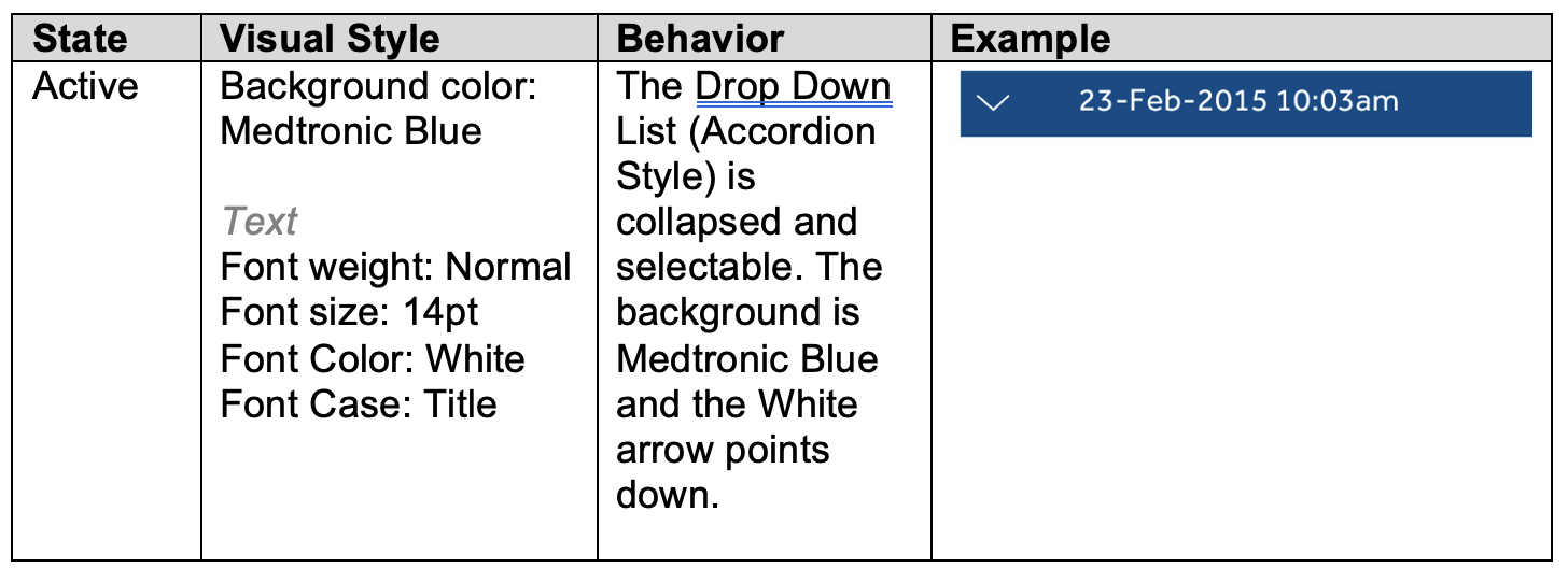
If you go to a component page, it should have everything on it you need to define it. Not every component is going to have every parameter, but it should still be there. If it’s missing, nobody knows if that was an oversight or intentional.
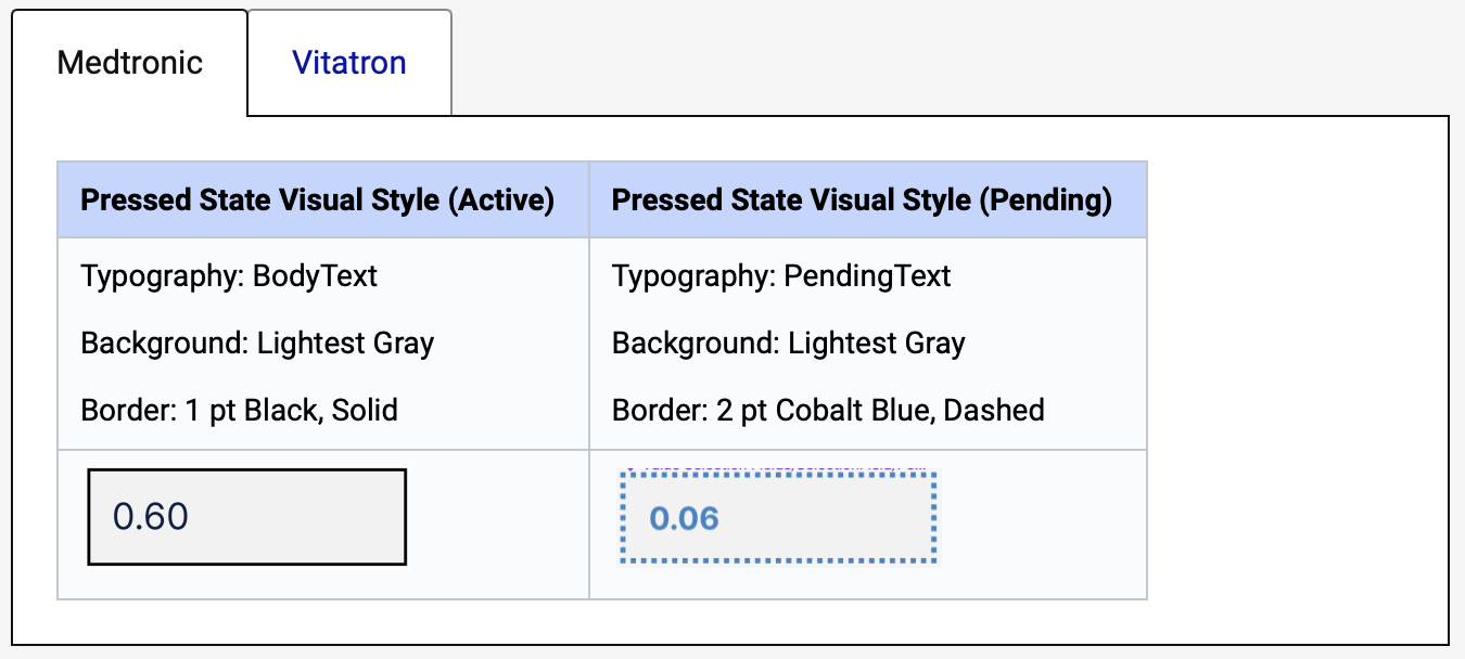
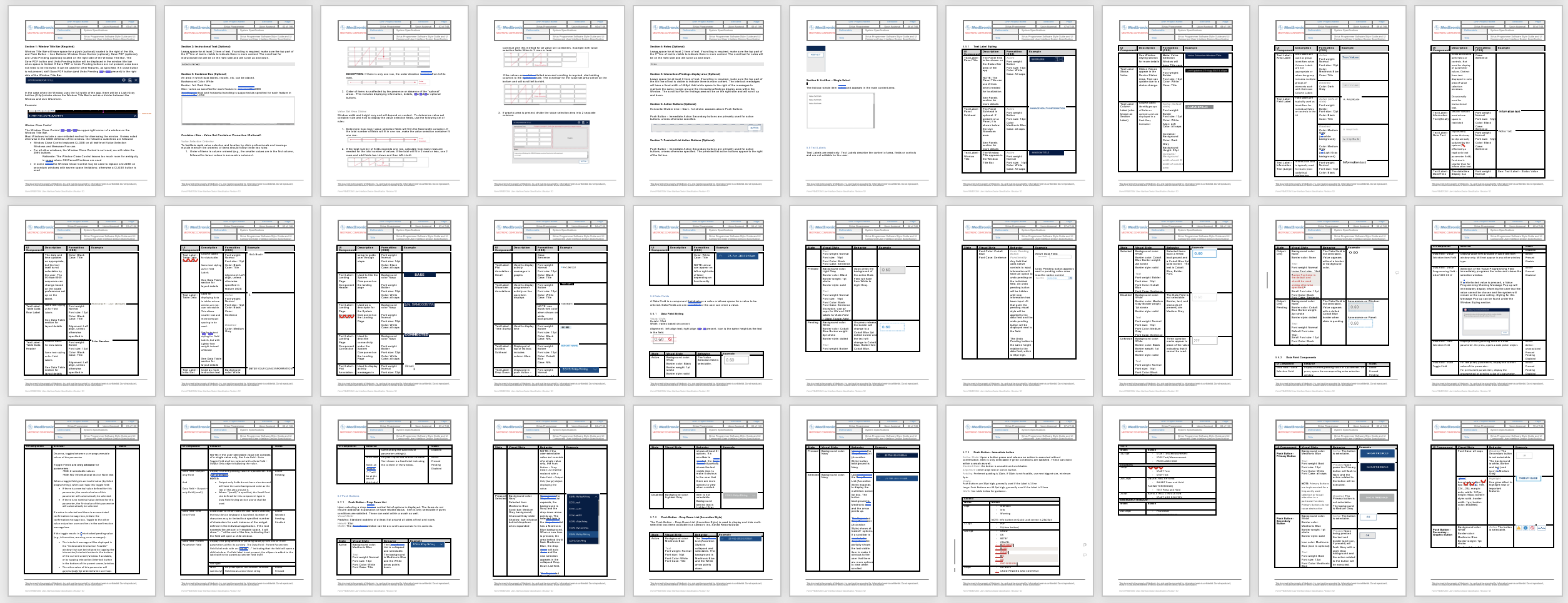
We rounded up every component used in SmartSync and figured out all the different parameters that are needed to describe them. Background colors, borders, highlight states, variations — the works. We made a master list of it all, and then we made sure that readers knew exactly what those parameters were going to be for every component.
TOO MANY WAYS OF DEFINING THE SAME THINGS
We spent a lot of time editing, cutting, and paring components down. There were plenty of custom UI components that didn’t have to be unique. You know, if it wants to be a button, just let it be a button! Tabs will work there. Hey, actually, you know what — you’re right, that one really should be a custom element. Let’s get that in the guide.
But most stuff just wants to be one thing. It doesn’t have to be defined in six different ways in five different places. Just do it in one place, and explain the variations there. Do that, and you pretty quickly discover that most of these ✨very special✨ one-off designs can be combined into a single component, maybe with a few flavors.
 The 12 buttons on the left — and their variations, totalling more than 40 definitions — were reduced to these nine, with rules in place for working with icons and variations.
MISSING STUFF
If you make something hard to update, people won’t update it. Even if they’re required by law to have things documented — thanks, government reguations!3 Sure, we have our screens defined, but those definitions are supposed to be controlled by the style guide, and there were a lot of screens using stuff described nowhere.
 This screen is used hundreds of times every day, and only the checkboxes and text is controlled in our design system.
We went through every single screen and documented the things that were on them that had no match in the style guide. If we decided that it really needed to be custom, we wrote a definition for it. But if we could turn it into something that already existed? That’s gravy, baby. I want consistent designs made from a handful of parts that are easy for people to grok. Creativity thrives with restrictions.
DECENTRALIZED DESIGN
The style guide had no centralization. Everything got defined, then redefined, then redefined, and then defined again because there was no place to stick things. A great example is typography: we only use one font in this application, and in just a few weights. So why is it that every single component description had to go out of its way to describe the font and its weight? No wonder there are so many inline style descriptions: that’s the way the style guide is written.
 Pages 47–70 of the Word doc were just tables to define text styles — and that only covered about a quarter of what existed.
 Then every single component re-defined its own text. Making a change to any compontent required updating that text style everywhere it occurred.
So we centralized it. All the colors live in a Colors page. All the typography lives in the Typography page. If you want to know how to fit components together, go to the Alignment page.
Now, if you want a switch to be a certain color, you just have it point to the color name — don’t give me a hex value. Bonus: this means that if we ever update colors or fonts, all we have to do is change them in one place and it updates them everywhere.
 Example: colors are all in one spot. Just point to it!
That means we got those pesky sub-brands for free. Every Medtronic Blue turns into a Vitratron UI Green and suddenly we’ve got a re-themed application. Nothing gets project managers more excited than being told that something they thought was going to be really expensive is actually going to be free.
LESSONS LEARNED
#1: If something’s hard, people won’t do it.
Using the old style guide sucked. Updating it sucked more. Ergo, nobody did either.
First thing we did was put it somewhere easy to get to. No more requesting IT for access to a confusing developer tool that wasn’t even meant to be used for this kind of thing. Second thing was using a platform that made it easy to update. Once we did that, suddenly people stopped asking so many basic questions about designs. My daily emails asking things like “what color should this be” went from 50 to 10, and those last handful I could resolve by sending them a link to a style guide page.
The great thing about good documentation is that it encourages people to use it on their own. It invites exploration and becomes the first place they go for answers. People don’t need to email me about basic design questions anymore, so I can focus on building new screens with what we already have.
#2: Constraints solve problems.
A big fear from the engineers was that by making the docs more de- and pre-scriptive was that we would lose our ability to creatively solve problems. In fact, the opposite happened. The style guide turned into a box of Legos, and now we could focus on building interesting things instead of trying to figure out the details of how to mold plastic.
The style guide gives you a palette to paint with. It frees you from the weight of things like alignment rules, colors, and font choices and simply lets you design something that works. If you only have three typographic styles to choose from, you pick the one that works best and then you stop worrying about it.
Everybody hates starting with a blank piece of paper. You don’t have to do that with a good design system.
#3: The design of the document directly impacts the design of the system.
Conway’s Law is older than the moon landings and says:
Any organization that designs a system will produce a design whose structure is a copy of the organization’s communication structure.
If people rely on your documentation to design something, their designs will resemble that documentation. Get your docs right and it gets a lot easier to do good design. One-offs disappear. Centralization occurs. People get excited by the potential of it all.
Sixty years later and we’re still learning this lesson over and over again.
#4: It would have been a lot easier to build it right the first time than starting from scratch like this.
Hey, hindsight’s 20/20.
THINGS I WISH WE COULD HAVE DONE
Also known as “THINGS I DON’T LIKE ABOUT IT.”
Nothing ever shakes out exactly the way you want, especially when you only have 15% of your planned time. Working in a regulated industry adds another twist to things: some designs have been tested and approved by the government, which means we can’t change them without kicking off a long and expensive process that no one wants.4
#1: WE’RE STUCK WITH SOME STUFF
The original style guide defined 29 colors for the UI. Seven of them were just shades of grey. Nobody needs all that.

But we couldn’t do much about it — most of them got approved during the early safety testing. There are lots of little things like that: graphs have to have certain symbols, some icons can’t be changed. Signal strength indicators have prescribed segments. Medtech is weird, but I’m willing to make sacrifices if it keeps people alive.
#2: STAKEHOLDERS NEED THEIR SAY
Not everyone is a designer. Some people pushed hard (and got) things in the style guide that I didn’t want. That’s okay — compromise is important. The only way we got anything done is by knowing what things had to be in our vision and what things could be in other peoples’.
SmartSync isn’t the product of a single person, and everyone who’s going to be impacted by these changes has a right to voice their thoughts on them. I feel lucky to work on a project where we — the designers — were seen as experts.
A big part of that is because we came with evidence and research. No decision was made “just because” — there was a logical, grounded reason behind it. When every choice is intentional, people buy in quick.
That said, this thing still drives me crazy:
 It exists in two locations on one screen, where it mocks me.
I wouldn’t call the thing “finished” now. It’s not supposed to be. But we got the first version built, and that gives us all something to work with for the next one.
Now that it exists, people are finding all sorts of uses for it and things they want to include in it. Before we did it, most people didn’t even know it existed — and now they understand its power and value. It might not be perfect, but I’ll call that a win.
-
I call this the “hit by a bus problem.” If one person getting hit by a bus means you lose essential knowledge in your organization, you’ve got a problem. You better figure out a way to get it out of their head and into a place everyone can use it. ↩
-
You can trace a line from every single design choice all the way back to someone making a mistake or someone else trying to prevent a mistake from being made. It’s all rooted in data, baby. ↩
-
They really are important, though. ↩
-
I’m dedicated enough to this that I actually would go spend four months writing up a summative study just to further pare this beast of a document down. ↩