This is the text of a talk I gave in 2023 at the Medtronic Human-Centered Design Conference in Minneapolis. You can download my original slides here.
 Don’t Let Your Work be Useless
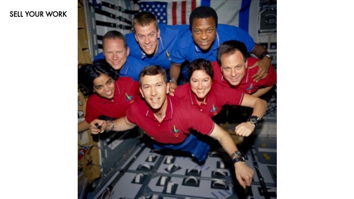 Hi everyone, thanks for coming. I want to start my talk today with a story about how PowerPoint killed seven astronauts. But to do that, first we have to understand some rocket science.
 Rocket science is actually very simple. All you have to do is combine your fuel with your oxidizer and point the resultant boom behind you.
 Now down on Earth, we have oxidizer everywhere — we call it the air. But nobody uses a V8 to get into space because the power of that reaction is limited.
 Also, there is no air in space.
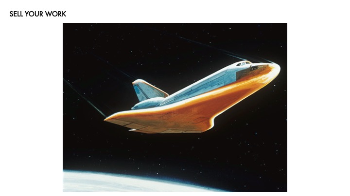
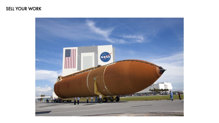 So instead we bring our oxygen with us in a big tank that looks like this. Now the tricky part about oxygen is that it likes to be a gas. But gasses take up a lot of space, so the oxidizer we bring with is liquid oxygen.
 Liquid oxygen is extremely cold. Like -297°F cold.
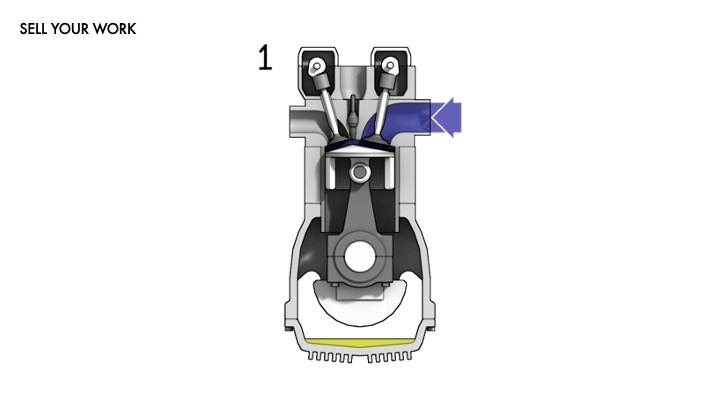
 To help keep it cool, the fuel tank gets coated in foam insulation. This foam isn’t too different from a can of spray foam you might have around the house. Highly-paid NASA engineers just spray it up on the tank to keep everything cool, and it dries in place.
 The thing is, when a rocket launches, there’s a ton of shaking and vibrations, and it’s often enough to knock the foam loose and have it fall off. In fact, this is so common that NASA actually has a lot of protocols in place to deal with it.
 Okay, now we need to talk about friction.
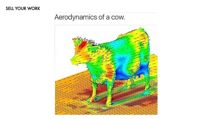 We’re not really used to thinking about it, but the air around us is a fluid. As soon as you start going about the speed of a car, the air particles bunch up together and create friction on things like cows and rockets.
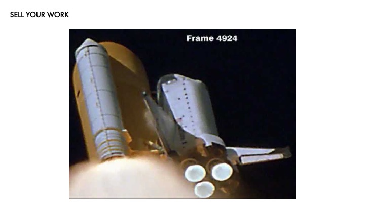
 The Space Shuttle enters the atmosphere 292 times faster than a car, at 17,500 mph. The molecules in the air get so bunched up around the Shuttle that the they stop being a gas and start being plasma —
 — the same stuff our sun is made out of. This is very hot.
 To deal with this, Shuttles have special ceramic heat shields that disperse the plasma away.
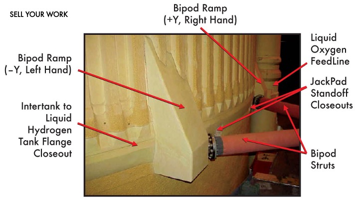
 When Columbia launched, some of that spray foam vibrated loose and hit the one of the heat shields on the wing. NASA fired up the foam strike protocols and had the engineers take a look at it.
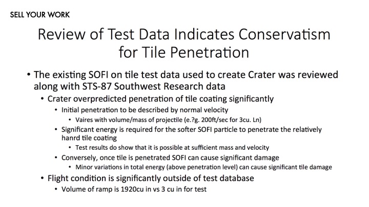
 The engineers responsible reviewed the data and presented this slide. Now, if you were seeing this slide and trying to determine how damage had occurred to the Shuttle, do you think you could?
NASA felt like they had a good handle on the situation. They believed that the engineers weren’t entirely sure what would happen, but they had enough data to suggest it would probably be fine. They went ahead and okayed re-entry.
So why didn’t they notice that the foam that hit the shuttle was 600 times larger than any previous data the engineers had?
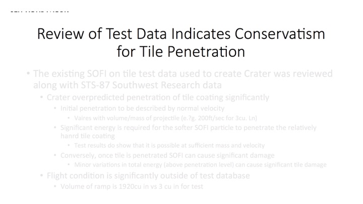 The first thing that’s wrong is the title. It’s nonsense, even for an engineer. What does “conservatism for tile penetration” even mean?
 They could have just titled it simply and obviously.
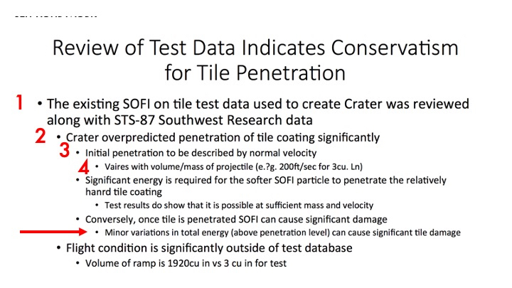 Second, look at the visual hierarchy and compare it to what’s actually written there. What good are all these indents and font size changes doing?
As readers, we’re used to a headline and body text. Big stuff is important, small stuff is details.
Second, look at the visual hierarchy and compare it to what’s actually written there. What good are all these indents and font size changes doing?
As readers, we’re used to a headline and body text. Big stuff is important, small stuff is details.
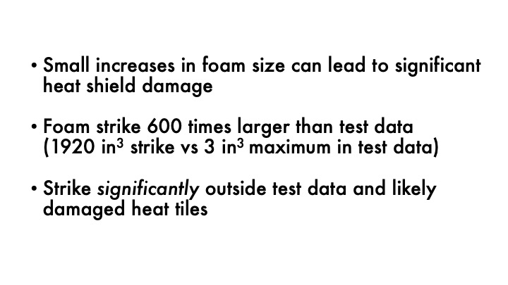
 But in fact the opposite is true here — this bullet point near the bottom has critically important information: small changes in energy can cause significant damage!
 And the key, most important point is the last point on the page. It says that the foam that struck the shuttle is more than eight gallons in size — that’s like dropping a double wide kitchen sink on the Space Shuttle — which is 600 times larger than their test data. That was the smaller than a deck of cards. And all of this is at the bottom of a slide with more than 100 words preceding it.
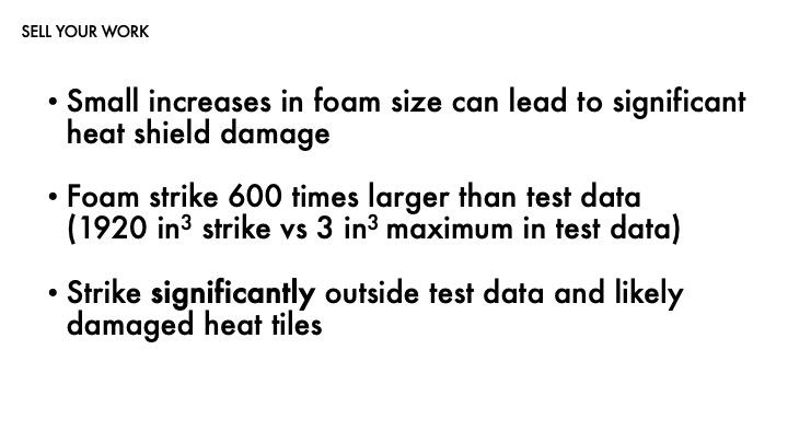
 What if the engineers had put up a slide that looked like this? Could they have saved the lives of the crew?
 Now that we’ve talked about the stakes, let’s get a hard truth out of the way.
 Even if your presentation won’t save the lives of seven astronauts, it will influence if your design gets built. If you can’t sell your work, it doesn’t matter.
 And the reason for that is this: you and me and everyone in this room got into design because to us, the value of good design is self-evident.
Good design improves the usability of a product! It sells more stuff! People want easy to use stuff!
And the reason for that is this: you and me and everyone in this room got into design because to us, the value of good design is self-evident.
Good design improves the usability of a product! It sells more stuff! People want easy to use stuff!
 You and I see a Norman door and it drives us CRAZY.
HOW COULD THEY DO THIS we ask;
IT’S SO OBVIOUS we say;
THEY COULD HAVE SAVED SO MUCH FRUSTRATION we rail.
But most people see this door —
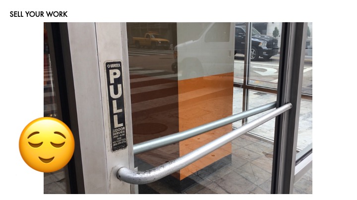 — and they go “ahh, I’m so glad someone labeled this.”
 And the reason for this is that we’re experts. We’re experts in the design, the research, the testing — concepts of designs and usability, the works. That’s why you’re here. That’s why people are listening to you. But the unfortunate flipside to that is that —
 — nobody cares about this as much as you do.
Okay, maybe that’s a little harsh.
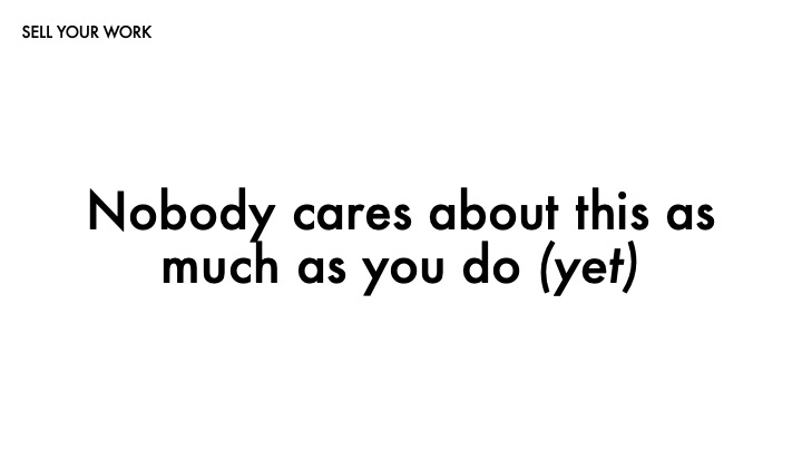 Nobody cares about this as much as you do — yet. Your goal is to get your stakeholders to get you there. And you know, we do this all the time in reverse.
 Research is empathy-seeking, right? We go out and research so we can develop empathy about our users and then go back and turn that into design. Now all you have to do is turn it around.
 Now it’s time for empathy building. Make your audience care about this as much as you do — or at least enough to get them to sign off on development.
 It’s easy! Just take all the work you spent 18 months doing and compress it down —
 — into a 30 minute presentation —
 — knowing it’s your make-or-break moment —
 — and if you don’t sell it, it won’t get built —
 — and if it doesn’t get built — oh my god, seven astronauts are going to die!
And if you’re not panicking now, you’re made of sterner stuff than me. But fortunately, there are some things you can do.
 Remember that your job isn’t to tell the whole story, it’s to tell the right story.
 You did a lot of great work. You learned a ton of little details and you are well-versed in the caveats and subtleties of your users. But remember…
 Nobody cares about this as much as you do.
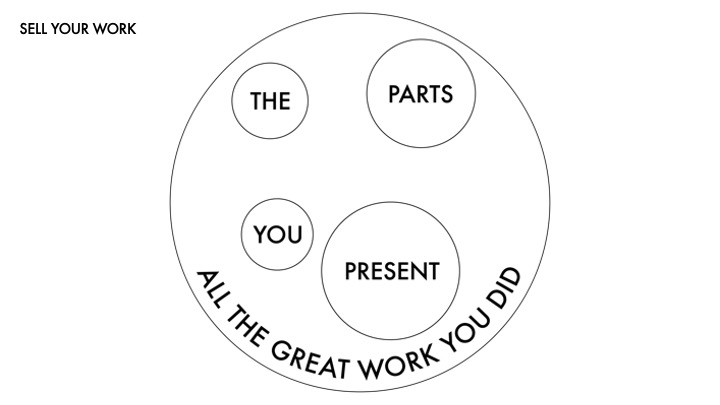 So what you have to do is pick the parts that are the right things to share.
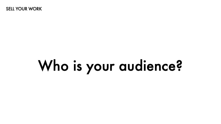 Ask yourself — who is your audience? Is it engineers? Is it managers? Is it your core team leader?
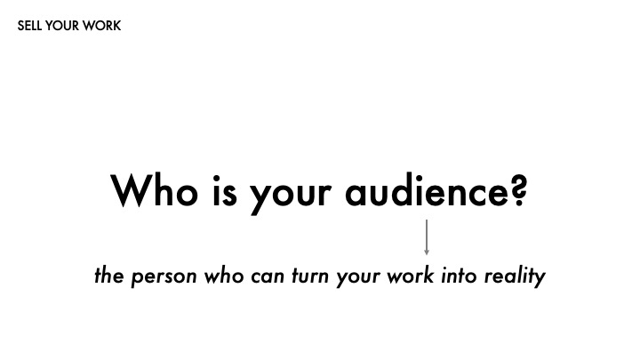 It’s probably the people in that room who can make your work real. Maybe your core team leader always listens to a particular engineer — that engineer is your audience. Maybe you need to convince an executive to continue funding your project — that executive and their team is your audience.
What an engineer needs is very different from what a manager needs. And how do you know what that is? Same way we do anything else —
 Pay attention to what makes them tick — and ask them what they care about. Do they want technical details? Do they care about the quirks? Backend impact? Give them what they need!
And if that doesn’t work, you can always turn to the things that motivate everything in business —
 — money —
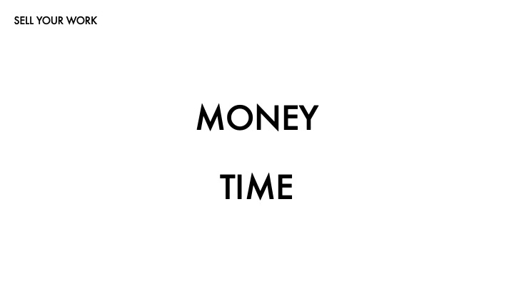 — and time. And actually, time is just another way of measuring money.
 Money is the motivator.
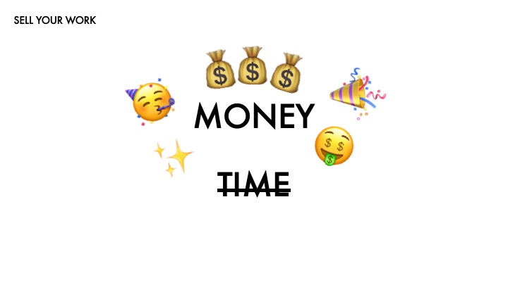
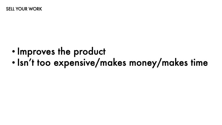
If your work is expensive, they won’t implement it.
If your work doesn’t make money, they won’t implement it.
If your work doesn’t save time, they won’t implement it.
So you have to convince them it does.
 People like stories. Thirty millenia of evolution has made us super-wired to remember and respond to them. So give your audience a story with stakes! what are you trying to tell them? What are you trying to explain?
You are trying to convince your audience that —
 — your work improves the product,
 keeps them in the green,
 and isn’t just your wild guesses.
 First you need to share everything that’s important to this audience. And remember, just because it’s important to you doesn’t mean it’s important to them.
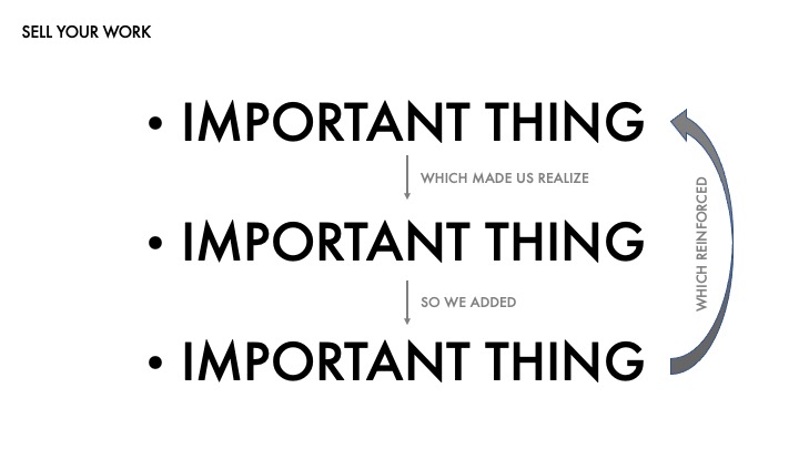 Then you should find the connections between them. Look for the thematic similarities. What ties these points together? How do they form a narrative?
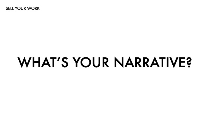 Ask yourself — what is your narrative? This is the heart of your presentation.
 Another way to phrase it is like this.
 Here’s an example from the world of data visualizations — this is one of my favorites. The story it’s telling is so clear.
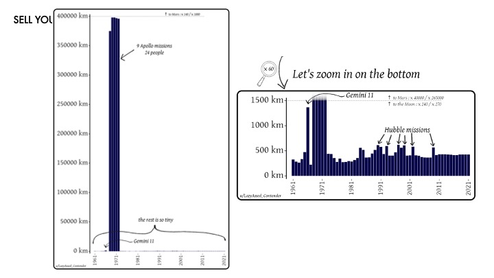 Here it is broken apart to make it a little easier to see.
The story is told in two parts. First, wow the moon is really far away. And then also, wow, it’s incredible we got there nine times.
But you could tell this story in another way. You could minimize the Apollo missions to really emphasize the uniqueness of the Hubble missions, or use the consistency of the post-2011 missions to demonstrate how we mostly just go to the Space Station now.
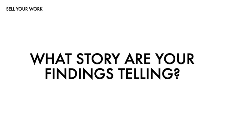
 But what you have to do is identify your narrative. If you think of it as a story, it begins with you knowing nothing and ends with you being such an expert in your users and their needs that you could build the perfect application for them. You need to share the important details, the key findings, your expert recommendations.
But numbers alone don’t tell us anything. Graphs alone don’t tell us anything. Facts alone don’t tell us anything. We need to know what connects them. What unites them into a story or theme or idea that your audience can grab onto and understand? We need narrative to make meaning.
 There is no right way to organize your presentation. You have to decide based on what makes the most sense for your data. Maybe it’s chronological,
or maybe you start with your final application and break down each feature or design choice. Maybe you open with your three or four biggest findings and walk us through how they influenced your final design. Maybe it’s none of these! The choice is yours — you need to figure out what will make for the strongest narrative for your audience.
There is no right way to organize your presentation. You have to decide based on what makes the most sense for your data. Maybe it’s chronological,
or maybe you start with your final application and break down each feature or design choice. Maybe you open with your three or four biggest findings and walk us through how they influenced your final design. Maybe it’s none of these! The choice is yours — you need to figure out what will make for the strongest narrative for your audience.
 Have I mentioned the audience enough?
 Keep your slides brief. Have graphs, images, whatever it is you’re talking about — but keep text to a minimum. Write your key points down simply and expound on them when you speak.
 Remember the NASA slides? Remember how they killed seven astronauts?
 Make your big points the big points on your slides. Don’t feel like you need to cover a lot on a single slide — in fact, I think the less time you can spend on a slide, the better. You need to be engaging people visually as you speak. Switching between slides quickly helps with that, especially if they’re supporting your talking points.
 Reading is a fundamentally different experience than listening. Your slides are there to give people something to look at. They’re visuals for the story you’re telling. They’re not your presentation — you are.
 There’s actually an entire slide format called Pechakucha that forces you to have 20 slides that last for exactly 20 seconds, limiting your entire talk to 6 minutes 40 seconds. I think that’s pretty restrictive — sometimes you need to spend more time on a slide to fully explain something — but it can be a good exercise to remind yourself how pacing really impacts a presentation.
 Right — You’ve got your narrative, you’ve got your slides — now it’s time for the rubber to meet the road. Here are some things to do in the room.
 Don’t explain. Definitely don’t apologize. “Thanks for the feedback, we’ll incorporate that” is all you have to say. And this can be really hard, especially when people are critiquing your work! But try to remember that —
 — it’s not personal. You are not your work. If it doesn’t hit, that’s frustrating and irritating, but it doesn’t make you a bad designer. It doesn’t make you bad. We all make mistakes, and we all do bad work from time to time. I’d like to give you some examples.
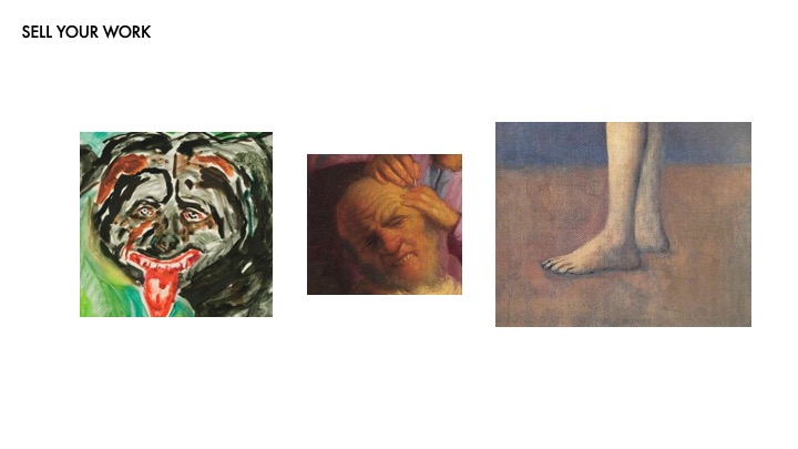
 Here’s a Rembrandt. He is known as a master of capturing light and detail.
 And here’s one of his that’s… not so good.
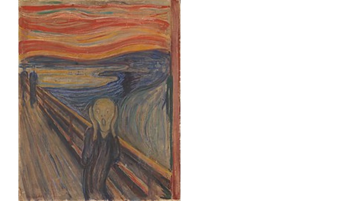 How about Edvard Munch, painter of The Scream?
 He was a great painter in many ways. Look at his use of color here the greens and blues in the skin, reds and blacks in the hair. Remarkable stuff.
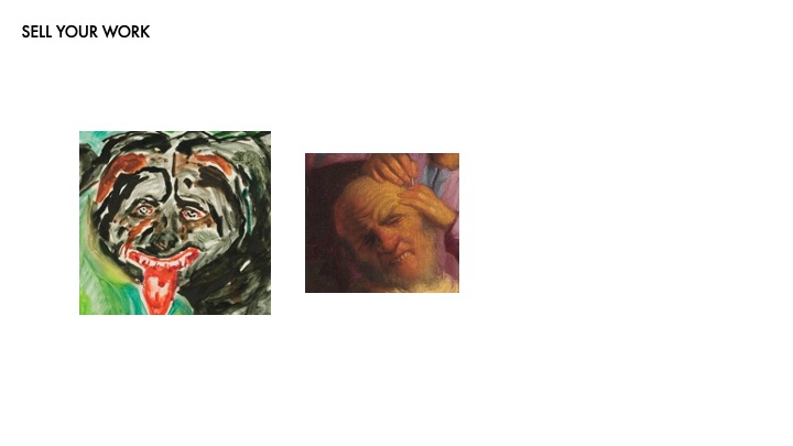
 This one… kind of misses the mark for me.
 Here’s a lovely painting of sleeping peasants. You might recognize this artist — he went by —
 — Pablo Picasso!
 But even he messed up sometimes. This poor girl is pretty awkward and weird. Where’s her other hand? What’s going on with her foot? Gertrude Stein said it “looked like a monkey’s.”
 So even if hearing criticism makes you feel like this
 Or this
 Or even like this
 Try to remember it’s not about you. Everyone just wants things to be good, just like you.
 The other thing to remember is that when they sign off — shut up! The fastest way to get someone to change their mind is to give them opportunities to do it. If you got what you want, stop talking.
 And don’t try to get that yes by cutting your work apart before you even present it. Remember, your responsibility is to provide the best interface for your users. Let your stakeholders tell you what they can’t do, don’t limit yourself for them. Give them the whole thing, not just what you think will be palatable.
 We’ve reached the end! I hope y’all found some value in this, and if not, I at least hope you found it interesting.
 If there’s one thing I want to leave you with, it’s this: at the end of the day, confidence sells it. You might feel like this guy…
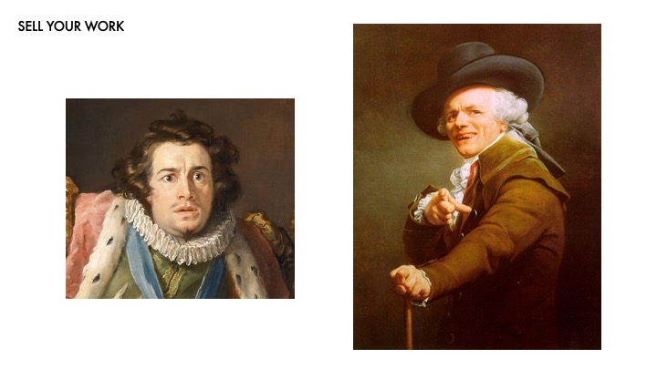 …but you should present yourself like this one. Thanks everyone!